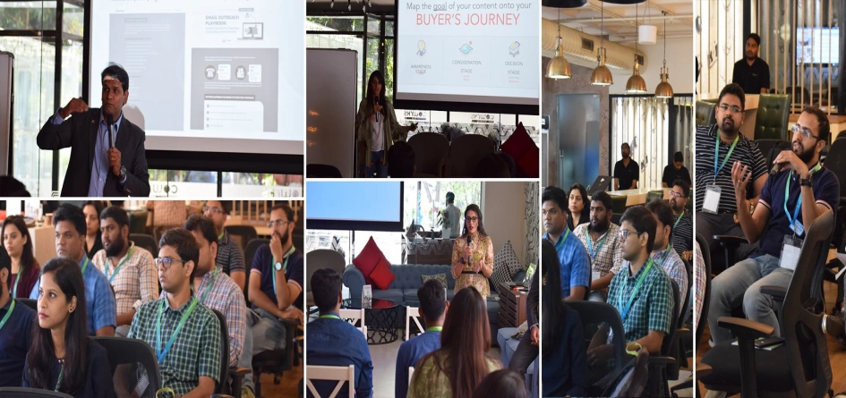

According to HubSpot, 84% of respondents feel that attending events is an important part of their job, with 79% going to events specifically to learn something. While you may think that sending a bunch of emails asking for registrations and then another bunch of emails reminding them might be all you that need to got those attendees to show interest; I am afraid, I will have to call the shots here. You might not be following the right strategy.
You might wonder, and I did too, before I realised that I did infact, need a strategy to plan out how I can attract more attendees this time as compared to our last event. I am talking about a well thought out content strategy. Just like any other campaign you run and the strategy you follow to have a successful one, when it comes to events, the same rule applies - get inside the minds of your audience. Ask yourself these questions:
- What are their key challenges?
- Why should they be attending the event?
- What should be the key takeaway from this event?
- How do they like to consume these takeaways?
It was acutally our second HUG event itself, which was on Content Marketing & Strategy, that got me thinking! And I thought to myself, if I applied the same content strategy here, I might even have a case study to talk about later. And that’s how the process began.
It is not unsual for organisations to totally ignore the buyer persona that’s going to be attending the event/webinar while writing the copy. Taking buyer persona into account while sending invites is something that’s slightly unheard of and even I didn’t know if that was going to work. Luckily, I was using HubSpot’s buyer persona tool already and had the whole picture mapped out for other campaigns I was working on. So, I jumped straight into it like a breathless fish gasping for oxygen. Our buyer person, I realised, was young to middle age, tech-savvy, and very much informed about what’s happening in the world. And that gave me my first touch point - world events and humor.
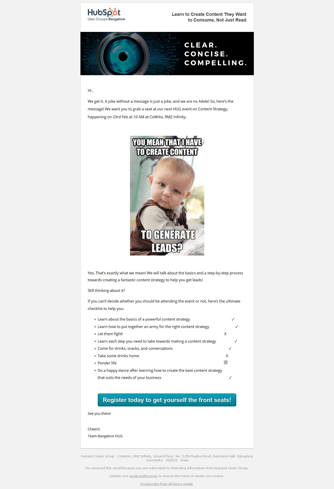
I had never tried humor before in any content assets; we had only gone as far as having a superhero theme for our entire site simply because we look at ourselves as heroes, and why not! So, when I thought of humor, it struck a chord. So, this is how the first email went to the audience with a subject line "Hello from the other side". However, that only gave us about 19.8% open rate.
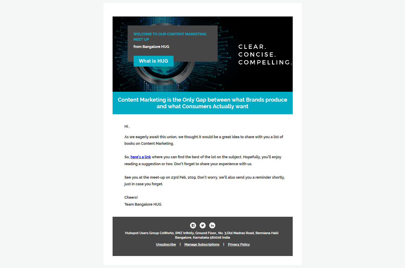
I thought so too! Even though I had introduced them to Adele, totally taking advantage of their age and interests, I had to give them something else in the meantime to help them make up their mind. So, in the next engagement email, I sent a list of books that they can read related to the topic of the event. These were some of the book that I had read myself and some that were highly recommended by pals and co-workers. And that did us wonders. The second email had an open rate of 64.9%. Vola!
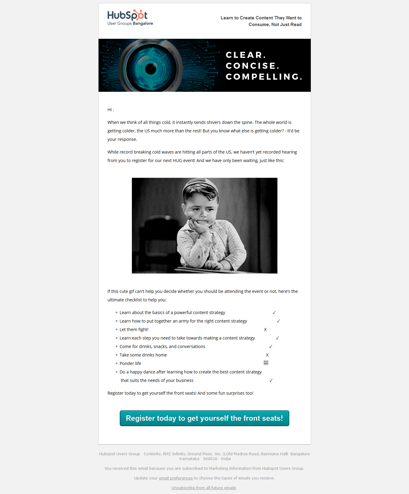
The first follow up was inspired by one of the most prominent world events of that month - the US cold waves (remember, the buyer persona is well read). Of course, it’s important to also keep in mind their sentiments and not come across as someone who doesn’t care about the wold events at the same time. So, to tone it down a little, I thought of inserting a gif of a little boy waiting. Now, who could say no to children, correct? And this is what the first follow up looked like.
By now, we had quite a few people showing interest in registering and it was time for the second follow up to go right before three days were left for the event. While discussing this with my marketing buddy, he suggested why not make it time-sensitive too and send out emails with the urgency of 3 days and then 1 day! So, I used the same gif of the cute boy waiting. And it worked wonders, again! By now, we had about 51 people registered for the event out of 101. And that was a 50% success rate. This is what the 2nd follow up email looked like.
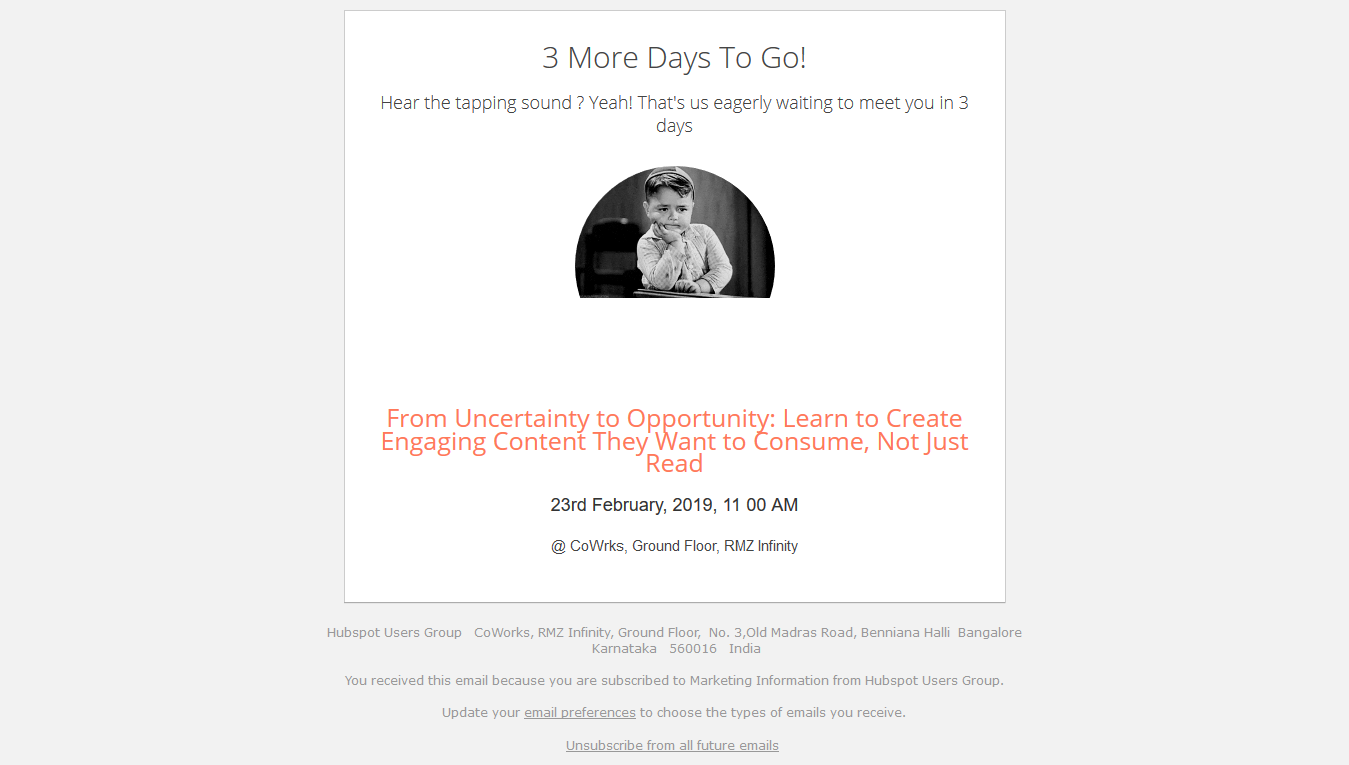
One day before the event, simply because we are such optimists, we sent out our final follow up cum reminder email. It was a gif of a happy guy getting very excited about the event happening in one day. This is what it looked like.
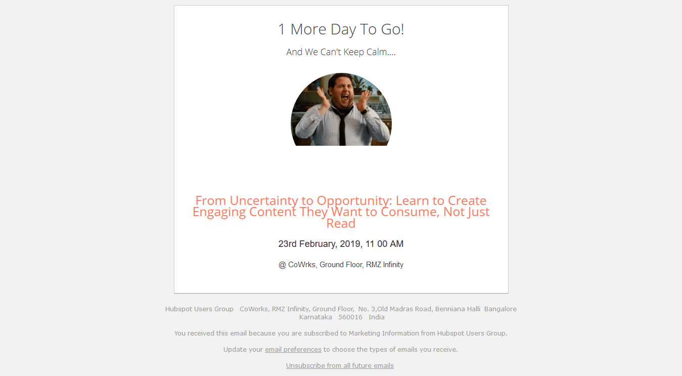
Apart from a lot of ladies (guess the happy guy worked well too) telling me how the follow-up/reminder emails made them click on the registration link, the winner was the cute little boy who was waiting in anticipation and one person even mentioned that he was not so cold-hearted and he wanted to come when he saw the email. So, not only the gifs but also the current world events dipped in sweet humor did the trick and we had 50% higher registrations and attendees showing up to the event than what we did in our last event.
Quick Refresher
Emails work when done right and if you are aware of whom you are targeting, meaning your buyer persona, and have tailored the content according to who they are, there is no way your event won’t be a gathering of a thrilled crowd. Furthermore, some other elements of the landing page such as the CTA need to be absolutely clear as well, conveying the right actions your audience needs to take.
There are many ways in which you can optimise your event/webinar invitations such as including a testimonial, a striking video, a peppy image or a gif, and even paid campaings, but which ones work well? That you’ll only know if you experiment a little bit along with incorporating your tried and tested ways. So, since we have tried and tested this, feel free to use the emails in your next campaign and let us know how it went for you! And if you have already tried something else and it has worked well for you, feel free to share with us in the comments below! After all, we are not cold hearted, right?
Have an event or a webinar coming up?